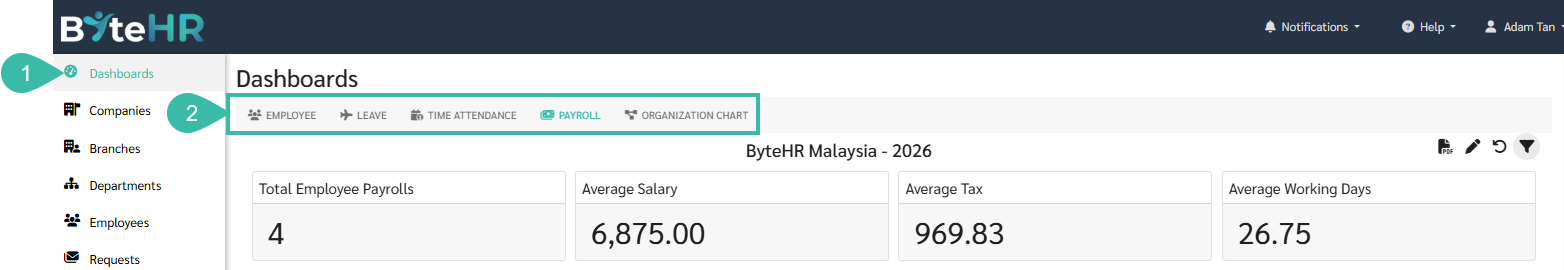
Viewing the Dashboard Report
A dashboard summarizes various data and displays it on a single page in different perspectives, such as graphs, numbers, percentages, and colours, for easy viewing. It also allows you to see data changes over time. Information from the dashboard can be used for workforce planning, budget analysis, and other related purposes.
There are 5 types of Dashboard reports:
1) Employee Dashboard
2) Leave Dashboard
3) Time Attendance Dashboard
4) Payroll Dashboard
5) Organization Chart
Here's How to View the Dashboard:
- Click on Dashboard.
-
Select the desired dashboard type.
-
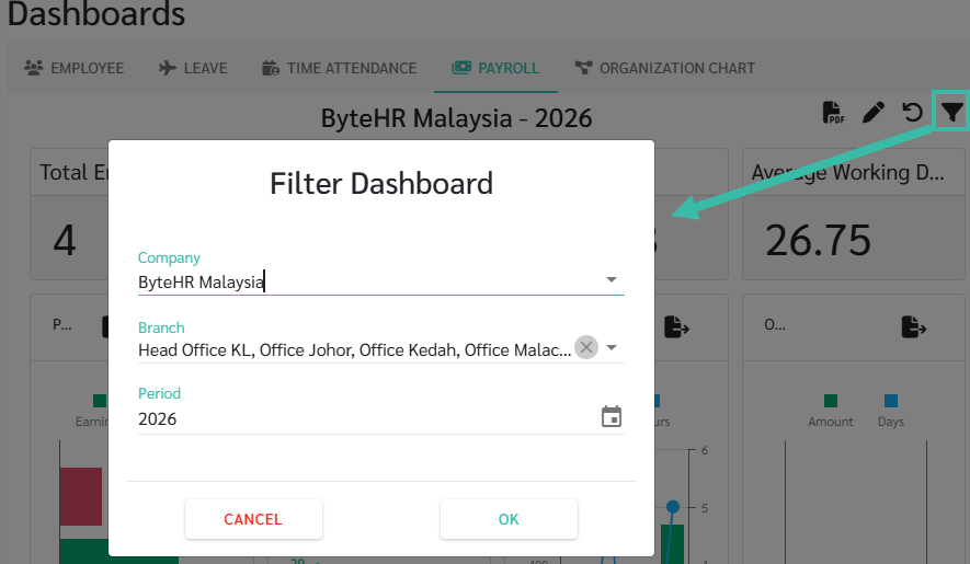
To filter the data, click on the filter icon to select the Company, Branch, and Period you want to view the data for.
-
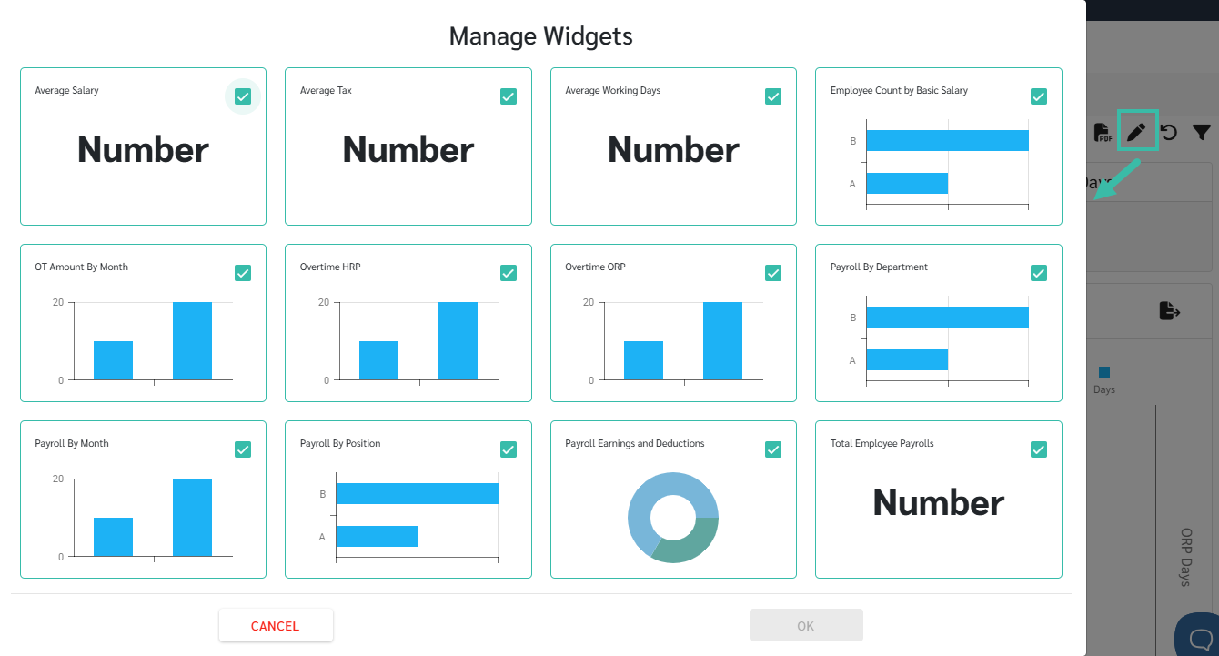
To hide or change the widget you want to view, click on pencil icon (edit), then select the data you want to display in the table report.
-
Click and drag the corners of the graph to zoom in/out as needed.
- Click and drag the graph to move it to the desired position.
-
To restore the default settings, click the Reset Layout icon.

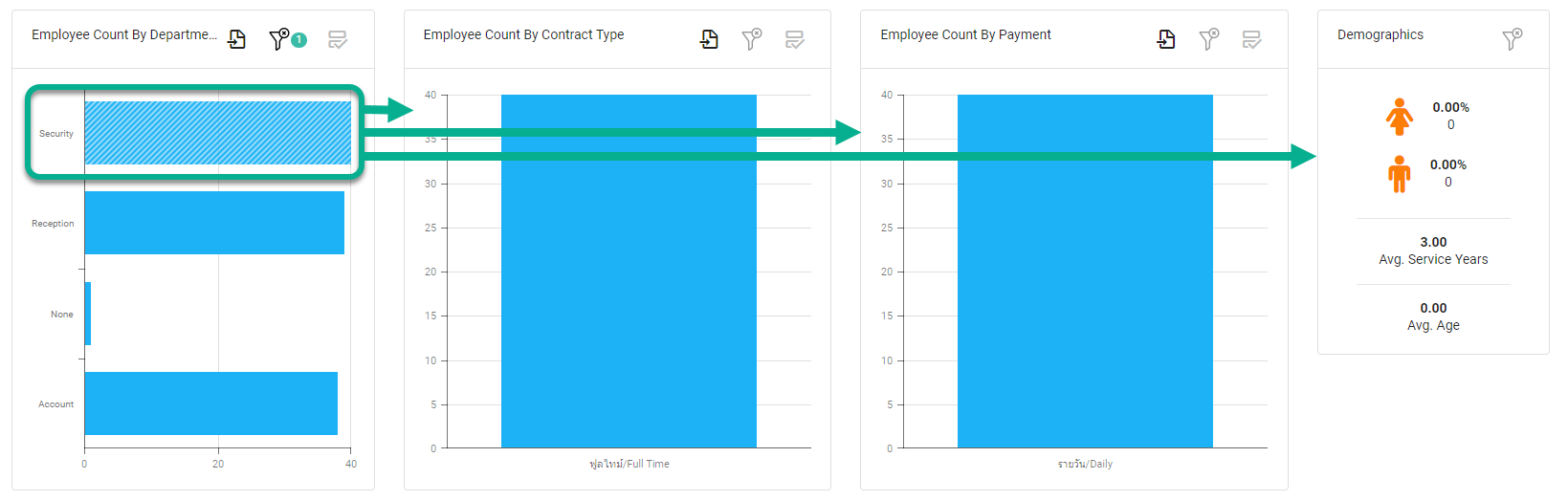
- In each graph, you can filter the data to display only specific branches or multiple branches.
-
To display data for a single branch, click on the bar graph of that branch. The filter icon will then display the number 1, while other graphs will only show data for the selected branch.
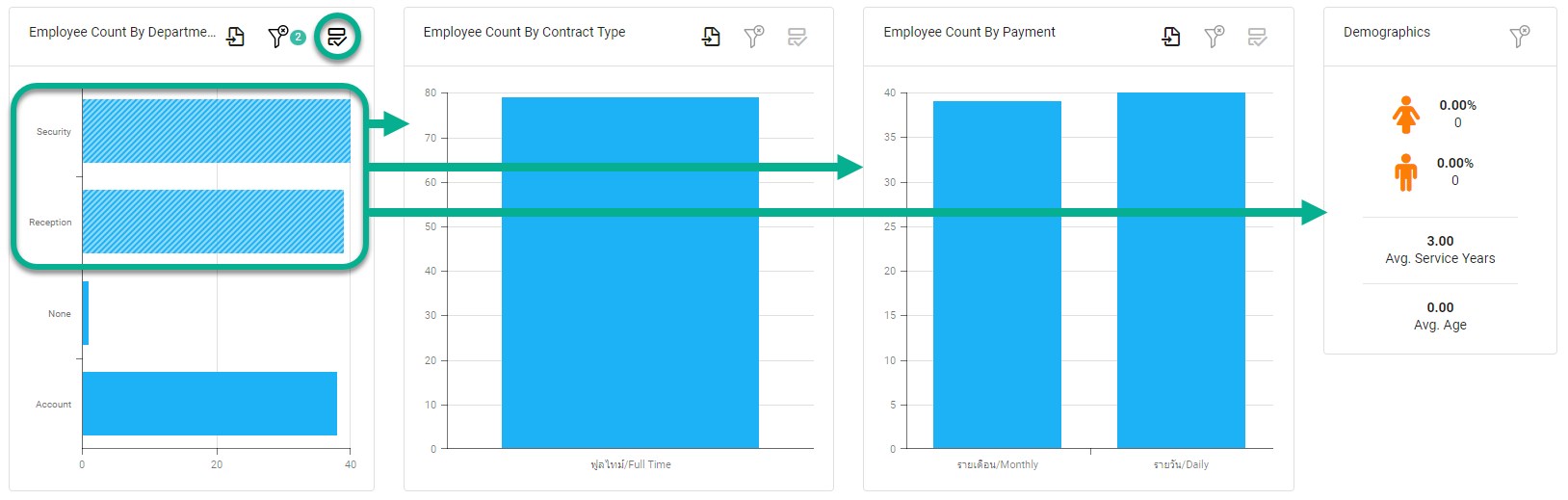
-
To display data for multiple branches, click the "Multi-Select" icon, then click on the branch's graph bar. The filter icon will display a number corresponding to the selected branch, while other graphs will show data only for that selected branch.
-
-
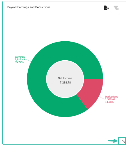
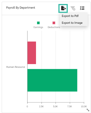
You can export the entire tab or individual topics as a PDF or image file by clicking the icon.

or
Export


- If you have multiple companies in your Account, you can change the companies using the filter icon in the upper right corner.